Update: These maps have been updated to the latest data for May 6, 2020 with larger text. I changed the color scale to make the contrast between low and high rates better.
Map and animation of all reported COVID-19 reported cases per capita by county, as of May 6, 2020 (click to enlarge).


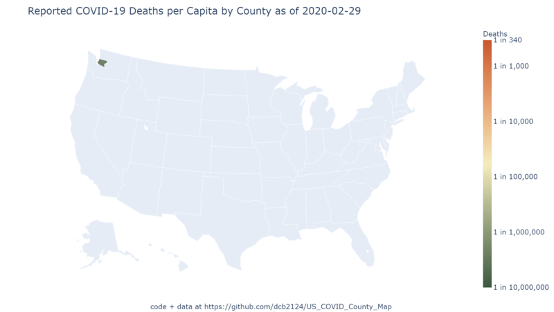
And here is a map and animation of all reported COVID-19 deaths, as of April 3, 2020 (click to enlarge).


Whereas in the previous maps I posted, it looked like rural counties were getting hit harder on the death rates, I think these maps makes it pretty clear that certain eastern urban centers are clearly worse off. As before the major epicenters continue to be New York and Miami, and to a lesser extent Detroit, Atlanta, and New Orleans. The Detroit, Atlanta and New Orleans don’t have quite as high cases per capita rates as the other two cities, but they appear to have a disproportionately high death rate, as compared to them.
The code (Python, pandas, numpy, plotly) and data for producing these maps, as well as an archive of previous maps, dating back to the first reported cases in the US, are available here. The original COVID-19 case and death data is compiled here by the New York Times. The estimated populations 2019 populations of US Counties is from the census.
Some notes on how it was produced:
- For several states, the NY Times has reported some cases with the county listed as “Unknown.” I simply redistribute these cases to counties that already have cases, proportional to the ratio of that county’s population to the sum of the population of all counties within that that state that already had cases. In other words, I assumed that none of the “Unknown” cases occurred in a county that did not already have reported cases, and distributed the “Unknown” cases proportional to the populations where known cases had occurred.
- The NY Times also describes New York City as a single county, when in fact NYC comprises 5 counties. I distributed all NYC cases to each NYC county proportional to the county’s share of the NYC population.
- NY Times also lists Kansas City, Missouri as single county, when it is part of four separate counties. I could not find any information on how KC’s population is distributed over these four counties, and KC, unlike NYC, is not coterminous with the counties it lies in. But the number of KC cases is relatively small compared to the cases reported from the individual counties, so I simply ignored these cases.
